Showing posts with label Grade 2. Show all posts

Wednesday, September 16, 2015

Owls

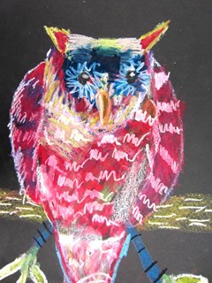
All of my K-6 students worked on owls this week using different mediums and focusing on different media and/or concepts.  Take a look at what my kiddos have been learning.....

GRADE 6:  We focused on REALISM.  I gave my students photographs of owls and they chose one to draw in pencil.  We talked about how to create the feathers using hatching and cross hatching with a black sharpie.  We used vine charcoal to create the gray values.  Drawing is just "seeing" and I encouraged them to really look at the lines and shapes in the photographs.  They were amazed at what they actually could see and record!


GRADE 5:  Here we talked about the concept of STYLIZING.  An image that is stylized looks like the object (an owl), but is designed using interesting ideas with shapes and lines.  We drew the contour of the owl and designed the interior of the owl.  Watercolor pencils were used over the black sharpie work, and a little water gave these that "painterly" look!


GRADE 4:  These owls were done on black paper with oil pastels.  Our focus with this lesson was layering the colors and VISUAL TEXTURE.  I challenged them to use lines to create the "feathery" look on the owl.  The layering off the oil pastels produces such a rich, yummy color!


GRADE 3:  We drew simple owls and used a texture plate in the background to create the cool patterns.  We used the educational watercolors which has 18 beautiful colors to choose from.  The colors in these were student's choice.


GRADE 2:  We used some of the painted papers we did on the first day of school for these backgrounds and students drew and cut out there owls, branches and leaves.  This mixed media project ended with a paint treatment using the end of a brush to create the white dots.


GRADE 1:  Letter Owls!  Again, we used some of the fun painted papers we made and used the letter U to make the owls body.  The letter B was for the eyes, the letter D for the wings, and the letter O for the whites of the eyes.  We used black marker to outline and construction paper crayons for the color on our dark backgrounds.  Cutting and gluing was a skill we practiced on these collages.  Collage is a french word which means to "paste".  Cute, cute, cute!!


GRADE K:  These owls were done as a directed drawing.  I asked my kindies to look and "see" all the shapes and lines that were used to build this drawing.  They did an amazing job of "seeing"!  We also worked on filling the entire page with color and I showed them how to do a little blending with colors.  They loved using the texture plates in the background!


Thursday, August 20, 2015

Painted Papers

As I begin my 37th year teaching ART, I realize that this love I have of students and art is really the only life I have every known!  Each year I stretch myself by trying new projects, and new ways to inspire kiddos!  I feel like I have grown tremendously in the last 37 years!  I was fortunate enough to hear an inspiring message by our Teacher of the Year, and it really put things in perspective for me. She told us to not forget about taking care of ourselves!  We need to put ourselves first so we can be there for students.  She also said what most of us already know, but usually forget.... and that is.... kids don't remember how your room is decorated or the posters you have up.  They remember YOU.  That got me thinking about my favorite teachers and why I like them SO  much.  It was because they made a personal connection with me!    Teaching over 550 students makes that a daunting challenge to say the least!  But my goal is to get to know my students through their art and art experiences!  Making art that is personal to them is my vision for all students!  With that said, on with the planning of art lessons!

The first thing we did this year grades 1-6 was to spend a day painting papers!  What fun!!  We will have a great stash for projects this year.  I even pulled some of the papers back out to layer more paint on with the next class.


Tuesday, March 31, 2015

Pastel Rabbits

Oh cuteness!  After a simple directed drawing at the board with second graders, and outlining with a black sharpie,  I showed them how to use a gray crayon to shade around the edges of the white bunny.  All I had to do is show them someone's white shirt and they were able to see that even white has shadows.

Then I demonstrated the "wet on wet" technique with my educational watercolors.  By applying the water to the paper first, then dropping small amounts of watercolors into the water, we were able to create the light pastel colors so popular around Easter time.  I am in love with all the wonderful expressions on these bunnies!


Tuesday, March 3, 2015

Birds In the Style of Matt Sesow

I ran across this artist on Pinterest a year ago and started doing some research on him.  Matt Sesow.   I made an immediate connection because he was born and raised in Nebraska.  So was I!  I discovered he lost his arm in a plane accident.  You can find out more about his life HERE.   I show a power point, which you can access HERE.  The first slide is a picture of him.  It takes awhile, but all students finally recognize that he is an artist who only has one arm.  The kids were enthralled with this, and the fact that he was a self-taught artist.  He now lives in Washington D.C. and works full time as an artist.

We focused on his paintings of birds and I had students pick out elements that were the same in all his work.  Here is what they noticed.

* He used concentric circles for the eyes.
* He uses lots of bright colors.
* His birds are painted using simple shapes.
* He uses black outlines around the birds for contrast.

So, we began with a sketch on colored construction paper in pencil, then outlined the sketch with black glue.  When I made my black glue at the beginning of the year and I used several things.  I mixed some with black tempera, some with india ink and some with black acrylic.  The acrylic gets a bit thick, so I would stick with the other two mediums.  Mixing 1/2 glue with 1/2 paint works best.


Once dry, we used oil pastels to add the color.  What I wanted my students to experiment with was layering and blending colors.  We talked about the colors on the wheel and decided the ones closest to each other would blend the best.  Analogous Colors!  We also decided that using white will work with any color to lighten it.  I got some amazing results!  Check them out.


My teacher example....


Wednesday, February 25, 2015

Sub Lesson

So I really hate being gone from my classroom.  Partly because it's a lot more work being gone, and partly because I really want students to have a quality lesson, not just a "filler" sub lesson.  I had to be gone for one morning to a collaboration and I found this awesome lesson HERE  at Mrs. Knights Smartest Artists on symmetrical monoprinting.  We used the alpha biggie tempera blocks and folded our papers in half to create these.  I took it a step further and when I returned, we added black marker for contrast.  Students from K-5 did this lesson and they were all successful and beautiful!  Some students chose to do abstract and some chose realistic images.  All in all, a work they were proud of!