Tuesday, March 31, 2015

Pastel Rabbits

Oh cuteness!  After a simple directed drawing at the board with second graders, and outlining with a black sharpie,  I showed them how to use a gray crayon to shade around the edges of the white bunny.  All I had to do is show them someone's white shirt and they were able to see that even white has shadows.

Then I demonstrated the "wet on wet" technique with my educational watercolors.  By applying the water to the paper first, then dropping small amounts of watercolors into the water, we were able to create the light pastel colors so popular around Easter time.  I am in love with all the wonderful expressions on these bunnies!


Friday, March 27, 2015

What a Surprise!

I was surprised with visitors in my classroom today.  I always welcome anyone into our art studio, and I immediately asked students to let our visitors know what we were working on.  Little did I know, they were there for a very special announcement.  The visitors were from the district selection committee and I was chosen as one of 12 finalists for Teacher of the Year.  We are a BIG district, but little did I know that we have over 1500 teachers in our 26 schools until they told us.   When my 4th graders heard this they began singing Happy Award Day To You....to the Happy Birthday To You tune.  It was heart-warming.

Each of the amazing 12 finalists had a small write up on our district website.  Here is what they wrote about me.  Truly humbling!

Ms. Welling teaches art at Cedar Creek Elementary School and has been an educator for 36 years, 18 years with the R-7 district. She has received two PEAK grants from the Lee’s Summit Educational Foundation to establish an art library in her classroom.  She is a published author in Arts & Activities magazine and has won several leadership awards through Artsonia. Ms. Welling also received the R-7 Learning for Life award in 2012.

I absolutely LOVE what I do, and consider it an honor to work with kids!  I love exposing them to art in a way that makes them think from a different perspective.  I see kids blossom and come up with all kinds of new and refreshing ideas.   They are the leaders of our future generation!


  On a side note...our school...Cedar Creek Elementary had another teacher, Kari Swezy (3rd grade) receive a nomination.  I feel blessed and fortunate to work with such talented, caring educators!


So blessed to have this as a memory of my career!


Organic Color Wheels

Every year my 6th graders create color wheels using only the primary colors of red, yellow and blue.
They mix the secondary colors of orange, green and violet.  They also create the six intermediate colors.  Those are yellow-orange, yellow-green, red-violet, red-orange, blue-green, and blue-violet.

Here are the formulas and how I teach students to mix those colors.

R + Y = O
R + B = V
Y + B = G

To mix the intermediate colors you

Add a little red to the yellow to make yellow-orange.
Add a little yellow to the red to make red-orange.

Add a little blue to the red to make blue-violet
Add a little red to the blue to make red-violet.

Add a little blue to the yellow to make yellow-green.
Add a little yellow to the blue to make blue-green.

Once they have a handle on all of that, we move on to mixing tints, shades and tones.  We use the neutral colors of black, white and gray to create these.  One rule I have when mixing these is ALWAYS add the darker color to the lighter color.
.
A tint lightens a color, so add the color to the white a little at a time to create various tints.
A shade darkens a color, so add the black to the color a little at a time to create various shades.
A tone dulls a color, so add the color to the gray when mixing various tones.

Now... on to the lesson.   Every year I have had students create wheels and repeat the designs in them.  They always turn out great, but I put a different twist on the wheel this year.  Here's what I did.

1.  Draw a large organic leaf form from top to bottom on a 12 x 18 white paper.
2.  Divide the leaf in half vertically.
3.  Create six sections on each side of the leaf. (Like the veins on a leaf)  You now have 12 sections.
4.  In each of the sections create 7 areas to paint.  Students will paint two tints, two shades, two tones and the main color in each section.  I had them try to create the same design across from each other to get a symmetrical look....even though it is not truly symmetrical.  In the past the transfer process of their design always took a lot of time.   Now, they can simply freehand their design.

Here is an example of what it should look like before they start painting.  I also have them label each section with the colors so they don't accidentally paint colors in the wrong spots.  This also gives me a quick overview of who knows the color wheel order and who still needs help.


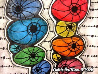
This lesson takes us 5-6 class sessions, but it is well worth it because they are learning to create 84 (12 sections x 7 different colors) colors and they have an understanding of how to mix these colors.  Here are some of the finished color wheels.  Once painted, they outlined the different colors in black marker and cut them out and glued them onto a neutral colored background.  This lesson is done before I commission them to paint a landscape.  Look for those in the near future.


Thursday, March 26, 2015

Farm Animals

As promised..... PIGS & COWS.  After our simple perspective farm painting, we worked on Picasso Roosters and then painted pigs and cows.  We drew these in pencil as a directed drawing, painted them with Alpha Biggie tempera cakes and finally used black watercolor markers to define the details.  I got some really cute expressions!


Wednesday, March 25, 2015

Kindergarten Rizzi Birds

After looking at several of James Rizzi's bird paintings, my "kindis" did a step by step drawing with me.  I showed them a front view and a side view of the bird's face.  We wanted ours to have a springtime theme, so they added flowers to the painting.  It was a great opportunity to practice our painting skills.

Here's how we did them.

1.  A basic sketch in pencil, followed by painting over the pencil lines with Alpha Biggie Tempera Cakes.
2.  We used a black marker to outline all our lines the second session, and used oil pastels to add color to the beaks, and flowers.


Aren't these just darling......


I LOVE the different sized eyes on this one.


Here are more of the precious Rizzi Birds.


Tuesday, March 24, 2015

Part of the Family

Our library features an author/illustrator every month and this month was Cynthia Rylant.  I read my third graders the book "Dog Heaven" by her and they shared their feelings about their pets being part of the family! It was touching to hear how important their pets were to their family!!  I followed that book with "Why is Blue Dog Blue" by George Rodrigue.  It was an opportunity to talk about color and why artists use certain colors in their work.


After an initial basic sketch on the board of "dog details", each student drew their own dog or one they would like to own, and we painted those in the Alpha Biggie tempera cakes.  Once dry, details, patterns and contrast were added with oil pastels.  Here are some of the results!


Friday, March 13, 2015

Borbz

I ran across Rita Nikolajeva, a Belgium tangle artist on Pinterest.  She is amazing and makes up her own zentangles and gives them fun names.  You can see her work HERE.

A BORB is a squished orb with a border.  Her work is in black and white and here was my first attempt at it.  I used curved lines instead of straight lines on the orbs and shaded to create more depth. I cut these out and glued them to black paper.


Then I thought it would be cool to add color to these fun shapes.  In these examples I painted the orbs in the bright educational Crayola watercolors before adding the black sharpie work in both fine and extra fine.  I used the extra fine for my patterns in the background.  I used vine charcoal to add the shading.


I was satisfied with these and began the lesson with my 5th graders focusing on creating depth with the curved lines and shading.  Here are some of my students getting started and adding their details.


They loved the process of creating these colorful BORBZ!
Check out the finished work!


Here are the steps to create these:

1.  Draw two rows of flattened ovals (orbs) stacked one on top of the other.
2.  Create a double lined border around each stack.  Leaving the white edge helps with contrast.
3.  Add a hole with a border and attach curved lines going in any direction.
4.  Paint the orbs.
5.  Sharpie all pencil lines with a fine point sharpie.
6.  Add a background with an extra fine point sharpie.
7.  Use vine charcoal to shade each orb and hole, as well as the edges of the stacks.

There are all kinds of variations with this!  Have fun!!


Thursday, March 12, 2015

Picasso's Roosters

After creating our farm landscapes, we jumped right into a farm animal unit using different mediums.  Students looked at Picasso's rooster before drawing.  We sketched these on 9 x 12 black paper, then I showed them how to use oil pastels and layer and blend.  This was a new concept for them as most just want to color the areas in.  I was pleased with their efforts!
Here is Picasso's rooster....


And here are my 1st grade roosters......


Love the "eat me"!!!!


Teacher example.....


Watch for our pigs and cows to come!


Tuesday, March 10, 2015

Going Fishin'

We looked at the colorful work of Sandra Silberzweig before we began this lesson.  You can find her work HERE.  This is a mixed media lesson and the students enjoyed working with all the different mediums.
Here is my example with the steps to create these.


1.  Divide your 9 x 12 white paper into 6-7 sections with pencil, then paint them different colors.  I used the Alpha Biggie Tempera Blocks, but any paint would work.

2.  The second class we outlined the colored areas with black marker and created simple designs in each with the black marker.  I told students to think about what they would see under the ocean to come up with some of their patterns.

3.  They used oil pastels to accent the black patterns and add even more color and detail.

4.  The last class we drew the fish on black construction paper and outlined them with Crayola sticks (wood-less colored pencils)  You could use oil pastels for this as well.  We kept the shape of the fish and details simple as there is a lot going on in the backgrounds.  The black is used to contrast all the colors!


Here is the student's work.